Wellington Brand Management

At the end of 2019, we sold a brand management engagement with Wellington Management and kicked off in January. Their brand team wanted clearer, documented design systems and standards around print, online, social and video.

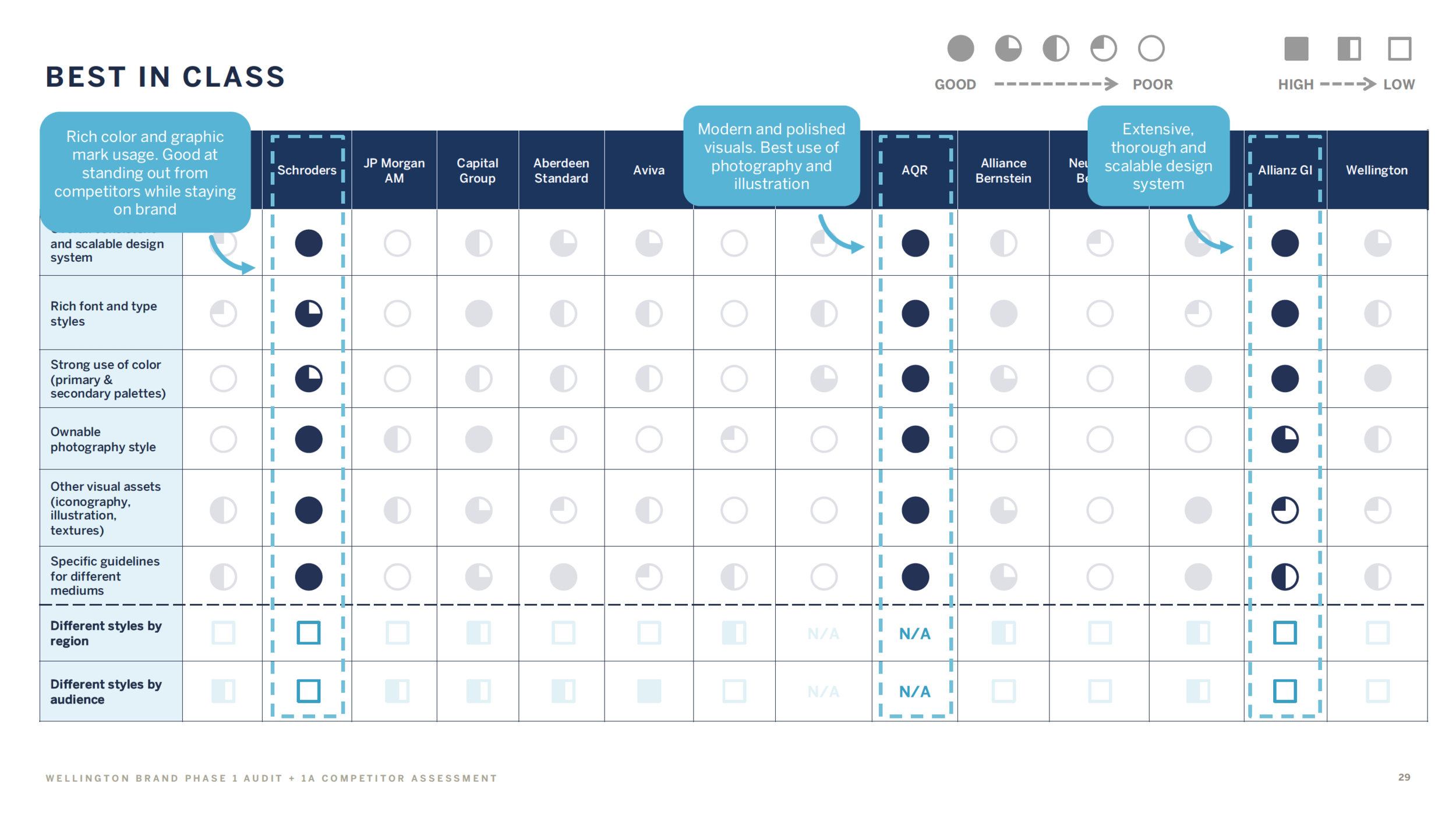
The team performed analysis of around competitive systems, ID, digital and print and photography styles across NA, EMEA and APAC, and we presented findings and opportunity areas for consideration and exploration.

We then created a series of channel POVs and usage guidelines and sample design artifacts across each channel and global region.

Ultimately, the work was delivered as batch findings, a deck and associated design assets delivered every three weeks.

We presented and sold our findings week week-over-week to the Wellington Marketing team as well as key stakeholders in EMEA and APAC, to proof our work globally.

The final body of work was successfully delivered end of Q1 2021, and the clients were thrilled with the outcome.

Credits:
ACD: K. Casey
ACD: S. Delaney
Sr. Designer: F. Balseiro
Client Partner: S. Maltzman
CD: J. Kelleher

Ascensia Diabetes Care

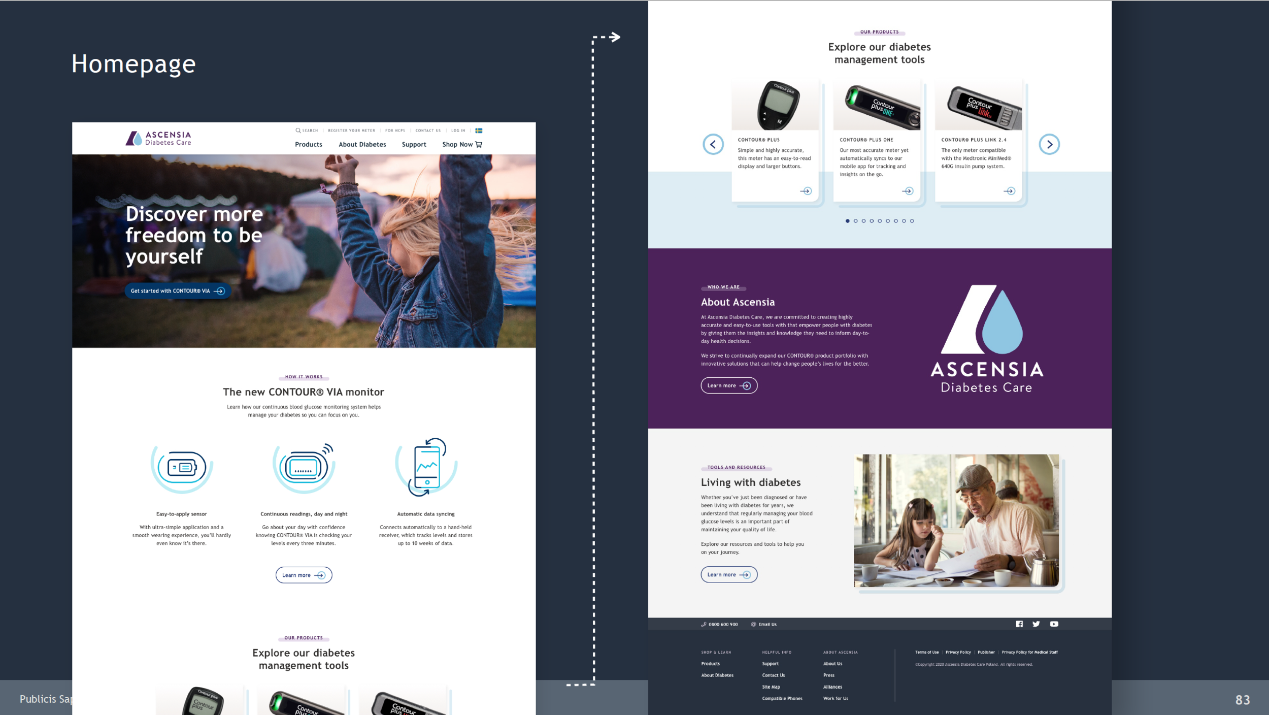
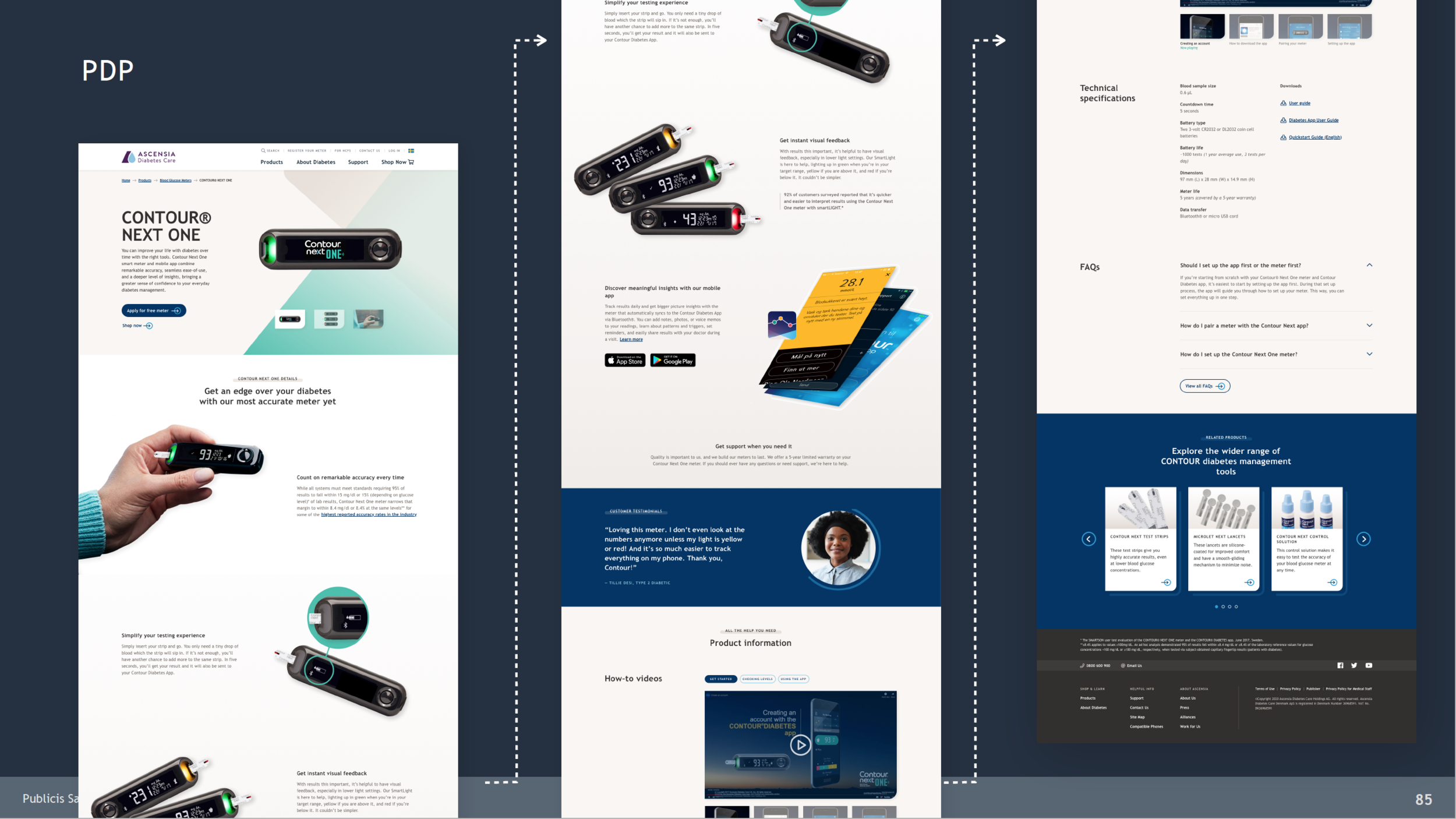
In November, the team received an RFP from Ascensia Diabetes Care, the makers of Contour diabetes blood management products. The brief noted that they had too many disparate (global) site experiences for customers, and a tight new product launch in some countries this coming April.

I pitched the project with some new pals (Mathias and Elisabeth) at Publicis Sapient, Paris.

We won the work and are deep in planning with Ascensia’s development partner, RightPoint, who work just across the street from us, on Water St., in Boston.

We’re getting aggressive on the timeline, but feel we can at least crush the beginnings of a new digital design system over the next few weeks, launch the new products in 8 countries, then come back around to a backlog of the work needed to make the Ascensia ecosystem clean, tight, right, and conversion-driven.

I hear there may be an app coming too, which would be cool, and with a new passport in hand (I think I liked the old one, where I was ten years younger, better), I am ready to visit Basel, Switzerland if they’ll have me.

In hindsight, we took on too much for a 6-week Define phase. The readout was good, but the team was buried in user and stakeholder interviews, competitive and comparative audits, sitemaps, flows, ecosystems, wires, flows and POVs on system and design, content and SEO too.

In the end, the work helped us create a POC that the business was proud of, and we had a working plan forward into detailed design.

Novartis Clinical Trial Recruitment

We partnered with Novartis this summer and fall to craft and then execute a 5-week engagement to identify key opportunities for the business to vastly improve how they digitally recruit patients for clinical trials. Every day a clinical trial isn’t completed, means hundreds of thousands and even millions per day in lost revenue.

In five weeks, the team immersed themselves in the clients’ business, made four trips to New Jersey for workshops and presentations, and the final output was a sharp, strategic Experience Strategy & Design presentation delivering the following:

  • Stakeholder input findings

  • Content audit findings and recommendations

  • Conceptual Sitemap

  • A complex user journey

  • Competitive audit findings and recommendations

  • Mobile and desktop POC designs for testing

  • 15 features and functions we believe most likely to increase conversion (patients into trials)

  • Gap analysis of the existing Drupal components against required components and LOE associated with each gap.

  • Batch design schedule for Detailed Design phase

  • The team required to move into Detailed Product Design and budget

    The plan is to design the digital platform experience and partner with Novartis’ development partner, to implement.

WEX Financial: A Design System Starter Kit

WEX is a global leader in financial technology solutions. They simplify the complexities of payment systems across fleet cards and payments, corporate payments and health, like gas cards, corporate credit cards and FSA cards.

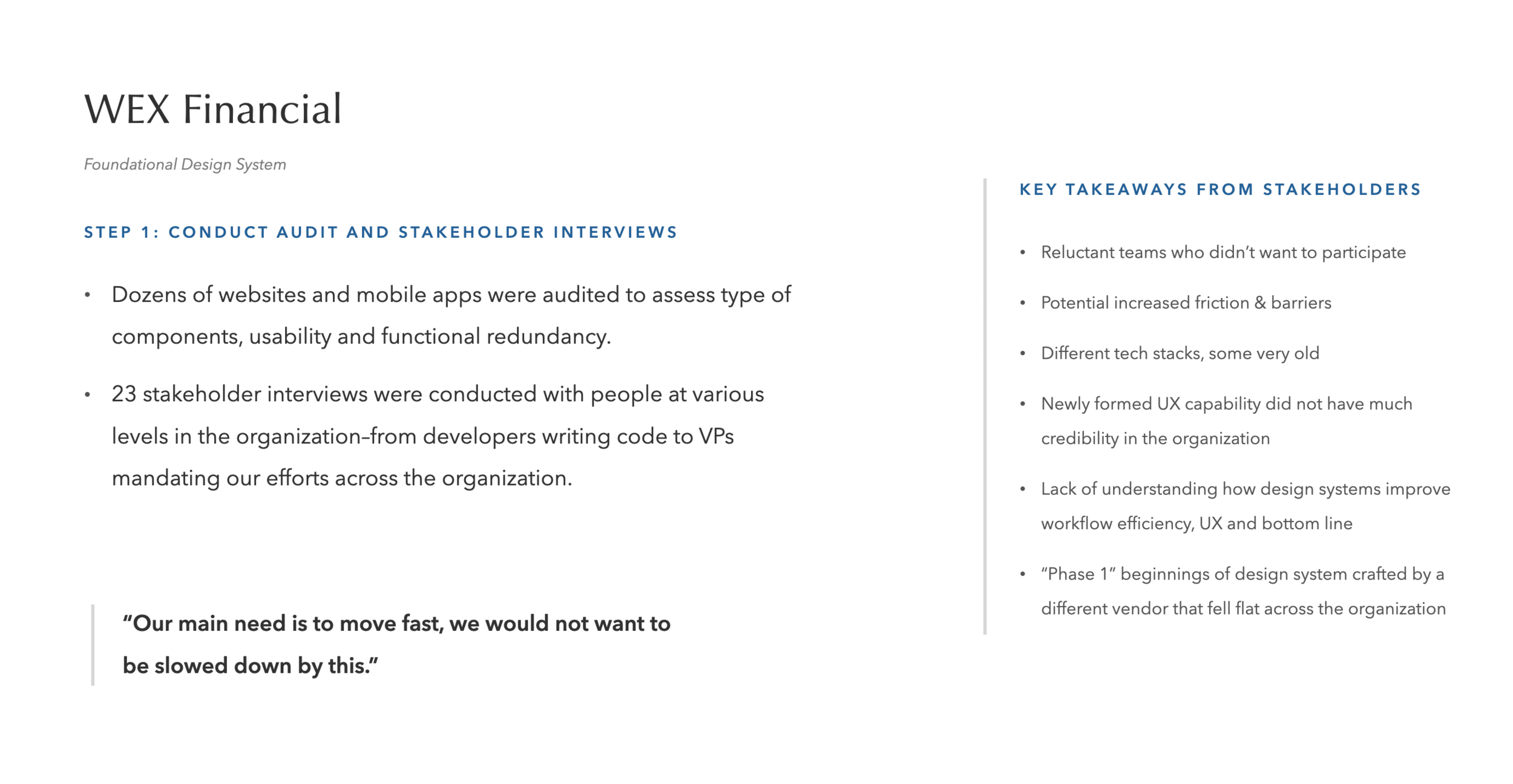
After years of acquisitions, WEX had dozens of disparate experiences across their web and mobile apps, providing customers who use multiple WEX products, fragmented, confusing customer experiences and causing internal complexity too, as the business struggled to operationalize the ongoing design and development of their software.

During our workshops in Maine, we talked a lot about speed and the need for speed. Eventually we dropped some images and video into our decks from Top Gun, and somehow, over the course of 6 weeks, ended up calling the design system Maverick!

We ran a tight, 6-week engagement, book-ended by workshops, and delivered a sort of design system starter kit—fonts, palette, button and link style, navigation schemas, and key components like calendars/date pickers, forms, search and chat. Additionally, we explored ways for third parties (WEX clients) to brand (or skin) the software in their own corporate brand while maintaining the integrity of the overall app designs.

BTW, the WEX offices are gorgeous—on the water in Maine, and the clients we worked with were some of the nicest and most fun I’ve encountered in many years.

Our kickoff team dinner turned into a stop at another place for drinks, and another stop for dessert and maybe even a third stop, before 15 or so of us walked back to the hotel, like a gang of kids, out trick-or-treating on the streets of Portland, Maine.

And The UK's Wilkinson Sword was next

Skinning Schick’s mobile and desktop components was harder to pull off for Edgewell’s UK shave brand. Localization issues and a great group of clients who had their own good ideas about ecommerce, SEO and a more European feel, challenged our objective to stay within the confines of the build we’d already completed for Schick.

I think there were two secrets to the success of this year plus engagement for Schick, Bulldog and Wilkinson:

  • A committed team on our end—the same team, every time.

  • A committed team at Edgewell HQ to drive the thing forward every day (Jen and Danielle were great).

And a few learnings too:

  • Having at least front end dev onshore, side by side with design makes for faster, more correct product design and development.

  • As much as clients seem to always want a fixed time, fixed price contract, a time and materials contract is often better. T&M affords them the flexibility to change their mind, make adjustments, re-prioritize and backlog, along the way. Having discussions about contract expectations also feels contentious, which stymies creativity.

    In the spring of 2019, Edgewell purchased Harry’s, and will be adopting their commerce platform for sales and subscription.

Bulldog, in Schick's Clothing

Work: Ecommerce Site Redesign & Hybris Implementation  

When: Winter/Spring 2018 

Role: Creative Director, Experience Strategy & Design 

After finishing up the Schick.com launch in June, the team set their sites on a client vision for launching another brand on their new Hybris platform, Bulldog Skin Care. Bulldog was a thriving UK brand and recent acquisition by Edgewell Personal Care that they wanted to launch in the US.

The goal was to re-use as many Schick components and templates as possible and re-skin them with the Bulldog Skin Care brand look and feel.

You can take a look at the new site, subscription model, buy more save more feature, the blog and full product catalog at Bulldog.com.

Screen Shot 2018-12-27 at 4.07.25 PM.png

Schick.com launched

Work: Ecommerce Site Redesign & Hybris Implementation  

When: Winter/Spring 2018 

Role: Creative Director, Experience Strategy & Design 

Well, we thought for sure it wouldn’t happen on June 28, but somehow, this new ecommerce Hybris implementation with around 60 templates and components across mobile and desktop, 10 integrations and a product catalog of a couple hundred shaving products for men and women, is live, and for sale at Schick.com.

June 28 was our deadline, and at 11:55PM on June 28, we did it.

We started discovery and concepting back in January 2018, then quickly moved across four batch sprints of design and copy, working hand in hand with our BA and onshore and offshore tech teams.

The highlights:

  • Guided selling for men’s and women’s razors

  • Brand landing pages for some longer form storytelling for each of Schick’s 13 shave brands

  • Photo shoot of their new products and some short video too.

  • Blog

  • Plenty of client/agency relations along the way

You can see the work live, at Schick.com.

Screen Shot 2018-12-27 at 3.49.18 PM.png
Screen Shot 2018-12-27 at 3.58.26 PM.png
Screen Shot 2018-12-27 at 3.58.47 PM.png
Screen Shot 2018-12-27 at 3.59.03 PM.png
Screen Shot 2018-12-27 at 3.59.19 PM.png
Screen Shot 2018-12-27 at 3.59.46 PM.png

Pitching pills, razors and geriatric milk shakes

2017 ended with a flurry of pitch work, across pharma (AbbVie), razors (Schick) and protein drinks (Boost).

We were in NY several times with Publicis North America for AbbVie, down in Jersey for Boost and down to CT, to meet new potential clients at Edgewell Personal Care, the holding company for a suite of skin care, fem care, diapers and pet products.

We ended up winning business across all three of these accounts:

  • An ecom-driven redesign for Boost.com to help with conversion and mobile experience.

  • An ecom redesign and tech build on the Hybris platform, for Schick.com men’s and women’s razors.

  • And three projects, currently being defined, for AbbVie (Digital Product Innovation work, a pharma website and a top of funnel, whitespace disease experience to educate patients about the risks of under treating disease.)

Coffee Commerce

Work: Ecommerce Site Redesign 

When: Winter 2017 

Role: Creative Director, Experience Strategy & Design 

Our team was asked to help rethink the Keurig.com ecommerce experience. 

We wire framed the new experience, created InVision mobile and desktop comps, conducted ongoing qualitative user testing, and created an annotated component library for their and our development teams to follow for a one year rolling rollout. 


Pod Love

Work: The Perfect Cup Web App

When: Summer 2016 - Present

Role: Creative Director, Experience Strategy & Design

In June of 2016, our team was asked to help Keurig devise a digital strategy to change customers’ perceptions about the brand and its coffee (often incorrectly positioned as ‘free office coffee’). The brand needed ways to appear more like the passionate coffee company brand that it is.

Based on the organizing idea Perfect is Personal™, we assembled a small A-team of experience designers, a product designer and a writer and pitched and then created and developed The Perfect Cup, a responsive web app quiz that allows customers to find their perfect cup of coffee, and learn about coffee flavors and profiles and Keurig’s deep knowledge and passion for coffee. The experience teaches customers about roasts and the flavor nuances that all coffees have, such as hints of chocolate, caramel, nuts, dried fruit and cocoa, and for taking the quiz, the brand rewards customers with a discount offer to try coffees that match their perfect cup profile. Customers have a fun, 3-minute experience, develop a deeper appreciation of Keurig’s vast selection of over 300 single-serve coffees.

The experience soft launched in December 2016 and results, usage and conversion are performing better than expected.