Fidelity Labs Assignment

Work: Fidelity Labs Brand Definition, Site Experience Design

When: April - July 2016

Role: Creative Director, Experience Strategy & Design

Coming out of the State St. iPad app assignment, the team quickly turned their sites onto a new brand definition and site experience engagement with Fidelity Labs. Labs has a tremendous ability to have an even greater impact on the Fidelity business, but to fully leverage that potential, every employee needs to know what Labs is and when and how to use it. Likewise, external audiences need to be made to understand not only that Labs exists, but what makes it so special. We partnered through stakeholder interviews, brand workshops and documentation, design, photography, usability testing and a new brand and site experience style guide. The result is an elegant little gem that looks great, sounds smart and gets talent calling and media wondering and wanting more. A fine example of what a great team working with good clients, can do in short order, for reasonable budget.

Usability Testing for iPad app

Yesterday, the team spent the day running our iPad app through usability testing with a handful of sales reps who will be using the app as a reference and point of sale aid in meetings with their clients and prospects.

We developed an elegant prototype in InVision (high-fidelity wires with interactions), wrote the protocol (moderator's guide) and orchestrated the means by which the clients could participate in the study.

App vs User: The app won!

What I learned: Successful, smart, type-A alpha sales guys (a little more so than the rest of the world) don't like to look incompetent in front of people, so more self-deprecating, 'blame it on the prototype' set up required next time.

Our morale is high that the prototype performed well across key objectives: 

- Simple, intuitive interface

- User can get in and out of the app--nobody gets hurt

- Content presents well: packaging, findability and is easy to save and share on the fly, in a sales meeting.

Next Steps: Design concepting and detailed visual design track.

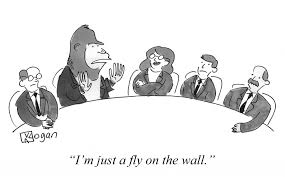
(*Image by Kogan)

2015 Mobius Award: Worldwide Creativity Competition

Received award for two brand content (interactive learning) experiences for the world's first Digital PET and CT Spectral Digital Scanners, from Philips Healthcare.

Great examples of short time frame, small budget, small-team creativity and front-end dev smarts to create compelling health-tech, digital brand experiences.


http://www.digitalpetlearningcenter.philips.com/
http://www.spectralctlearningcenter.philips.com/

Fidelity Charitable

Work: Experience Design Rapid Prototype, Detailed Design/Responsive Design, Prospect Marketing, Video/Storytelling, Brand Development (ID, Tone/Voice, Content Marketing). See: FidelityCharitable.org

When: September 2014 - Present

Role: Creative Director, Experience Strategy & Design

I led the pitch and worked directly with the client and account team to close our partnership with the world's largest public charity with over $12B in assets and $20B granted to charity since inception. We won the business. Weeks later, at an airport dinner, the client shared that of the dozens of pitches she'd heard from SapientNitro over the years, this was her favorite--she said it was relaxed, conversational, inspiring and low on testosterone. 

I worked with and managed a nimble (and amazing) team of 5, for a 7-week sketch & rapid prototyping phase in North Carolina and Boston. I presented and sold our work-in-progress every two weeks to the president and senior leadership team at Charitable. Hundreds of wires, sketches and PSDs later, we built an HTML prototype to sell the project into the board and move us along to the Phase II: Detailed Responsive Design & Build. The clients were thrilled that in just 7 weeks we were able to define a vision, draft a worthy brief and create all the assets required to build the prototype. 

Fidelity Charitable Prospect Experience Homepage

Charitable_Concept.jpg

In October 2015, we helped Fidelity launch a beautifully redesigned, completely rebuilt experience, finally replacing their early 2000s-era aesthetic and table-based HTML with an elegant, intuitive, and fully responsive design.

The work focused on two key experiences: the customer application for the donor-advised fund itself, and the public, prospect-focused marketing website. In both cases, the goals were in keeping with the organizing idea: “Inspire to give simply”.

For the donor-advised fund, we re-envisioned the existing 'grant flow', turning 17 steps into 3 and making it incredibly easy for users to search for charities and donate to them (even allowing multiple donations at once, which wasn’t previously possible). With our help, our experience technology team created a slick, responsive, single-page application using AngularJS.

For the marketing website, we conducted an insightful usability study, and created a rich, informative experience for prospective customers. We implemented this as a static site, created from a set of modular components and generated with a simple build process. This approach allowed us to launch in a matter of weeks with a very small team, while allowing Fidelity Charitable to easily integrate the code into a content management system down the road.

Customer response to the work has been overwhelmingly positive. Here is one of many quotes from a real user:

I really think you have done a super job making the site efficient and easy to use. I love the list of proposed grants on the left side, and the ability to scroll all the organizations we have supported, when, and for how much. Bravo. Tell your designers they are terrific!

Once the customer web app and marketing site was complete, we created two beautiful, inspirational video testimonials for launch content. 

And finally, we interviewed several donors and created long form body copy pieces for the site. The videos and interview content provide inspirational site content experiences for users and serve as helpful content from an SEO perspective.

To see the site, visit FidelityCharitable.org.

To see the site, visit FidelityCharitable.org.


MindBody Branding & Mobile App Redesign

Work: MindBody Branding & Mobile App Design

When: Spring/Summer 2015

Role: Creative Director, Experience Strategy & Design

Mindbody sits at the intersection of wellness and technology. Its scheduling and booking engine powers thousands of exercise studios and salons across the country, and its consumer-facing mobile app lets wellness enthusiasts find, book and pay for their favorite classes and services.
 
Our job was to help Mindbody define its brand identity and then apply the new look and feel to the app. A series of brand strategy exercises helped us pinpoint the Mindbody brand. Then design and copy explorations helped us find the best way to express the brand's look and feel and tone of voice.

Next, we re-imagined the app's user experience in wireframes, and then applied the new visual designs to each flow. The result is a thoroughly unique, modern and energized way for customers to find, book and pay for wellness every day.

Concept Category Browse

Matching Users to Wellness

Concept Business Detail Page

Search Results with Swipe to Schedule and Book


ING/Voya Rapid Prototype

Work: Rapid Prototyping of Retirement Tool

When: Fall 2014 (work lead to continued partnership with Voya through present)

Role: Creative Director, Experience Strategy & Design

As part of ING’s efforts to re-brand retirement, we helped them create a new type of 401(k) management tool for their enterprise clients’ employees.

Our strategy was to infuse practical financial functionality with rich editorial content and inspiration to give people a more holistic view of their retirement readiness and then help them make informed, intuitive changes to their savings plan in the moment.


This multi-faceted approach helped boost people’s engagement with their 401(k)s—something that typically doesn’t drive excitement—and, in fact, led to an impressive 13% increase in contributions among people who had access to the new tool.

Our design prototyping assignment was the successful beginning of what has been a strong, long-term Voya/SapientNitro partnership that continues as of this writing. 

Philips Digital PET & Spectral CT

Work: Philips Digital PET & Spectral CT: Interactive Learning Experiences

WINNER: 2015 MOBIUS AWARDS WORLDWIDE CREATIVITY COMPETITION

When: Summer 2014

Role: Creative Director, Experience Strategy & Design

Philips Spectral CT Scroll & Learn Experience

Philips initially approached us with an ask for a digital library to house white papers, videos and PDFs for two of their imaging products. Instead, we worked together through a concepting phase to create two short but content packed digital storytelling experiences that challenge the user to see the difference between old, conventional imaging and the world's first CT and Digital PET imaging products. On short time frames and even shorter budgets, the team was able to create two beautiful experiences that illustrate Philips solutions and outcome-based product philosophy.

Philips Digital PET Scroll & Learn Experience


PhilipsLifeline.com

Work: Redesign Philips' ecommerce experience for Philips Lifeline. 

When: Summer 2014

Role: Creative Director, Experience Strategy & Design

Elevating emergency response
In a category known for fear-based selling and price-driven promotion, Philips Lifeline wanted to distinguish itself from its competitors and find a better way to connect with its audience. We helped them do so by redesigning their website experience and introducing e-commerce capabilities.
 
Our strategy was to communicate clearly, dial up the emotional optimism, focus on family, and include caregivers as a primary user audience. A series of testimonial videos from subscribers, caregivers, and response team professionals helped bring the Lifeline product and service to life online. The site was also designed to be fully responsive, a mandate for all Philips web properties that came out of the global brand guidelines refresh SapientNitro helped Philips create.
 
The work included an experience strategy phase, XD and visual design concepting, content strategy, detailed design and implementation. Highlights for this project included a Help Me Choose feature based on our research (interviews and 'listen ins' at their call center) prior to wiring or designing anything.

Since its launch in March 2015, the new ecommerce-enabled site has dramatically increased engagement, leads and conversion.