In January 2020, I met with a few folks from Fidelity’s innovation group; a conversation about Sapient and my team with some capes and creds mixed in. I met them again a week or so later, and they shared they needed an ultra-beginners investing app, but as their vision and GTM plans were not set, details were light.
We were invited to pitch against a handful of other shops in February.
And we won.
The early plan was to create a rapid Define Phase followed by a unified Detailed Design Phase alongside their development team. But as they say, the best laid plans of mice and men often go awry.
The product had a strong client team, but no name, logo, palette or ID and we had under three weeks to create that.
“And this little shit showed up too, and well, that changed everything”.
Little shit #19
In late February, our client said, “I’ve spoken to Abby Johnson, and it’s business as usual—nothing’s changed.”
”That’s unusual,” I thought. “I haven’t been to work in three weeks and I’m in my garage on Zoom. Something had changed”.
We had adopted wolf-packs long ago at Sapient (teams of creative leads who work together again and again) and that chemistry and closeness and safety helped us immensely as we set on the journey to create an app from scratch, with around 20 people, all working from their bedrooms, kitchen tables, basements and garages.
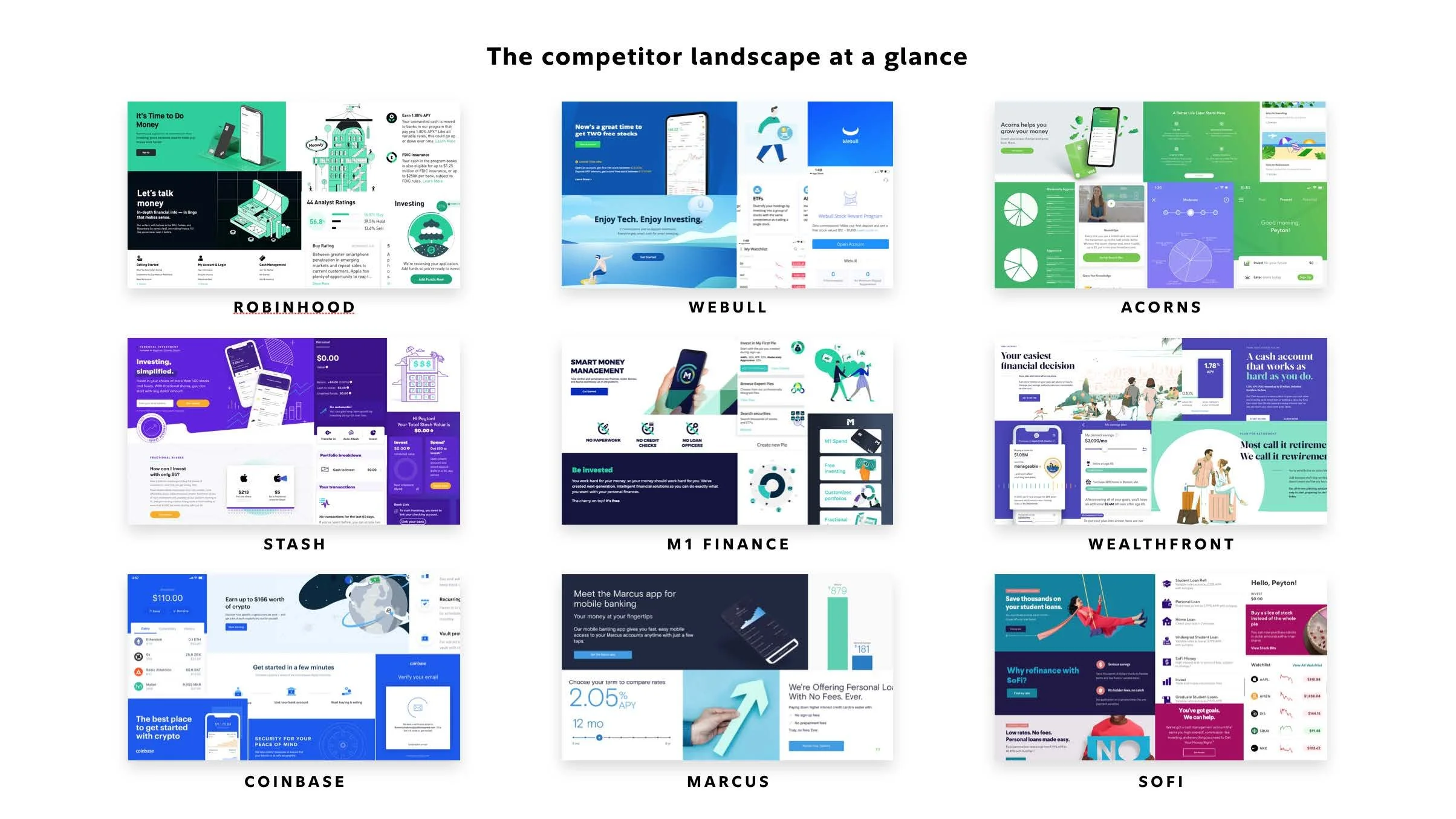
We shaped a rapid, 3-week ‘brand-lite’ experience to analyze the competitive landscape and create a palette, fonts, illustration styles and the beginnings of a system by way of a pattern library. This evolved over time, but notional and directional alignment was important, prior to moving at velocity, in Detailed Design.
First, we looked at the landscape.
A competitive look around for inspiration and opportunities.
Then analyzed our findings:
Brand-Lite Findings
And quickly developed two concepts for consideration:
Early design concepts
And from there, moved into Detailed Design.
Not too shabby…thanks to an extraordinary experience and design team and smart and driven client partners!
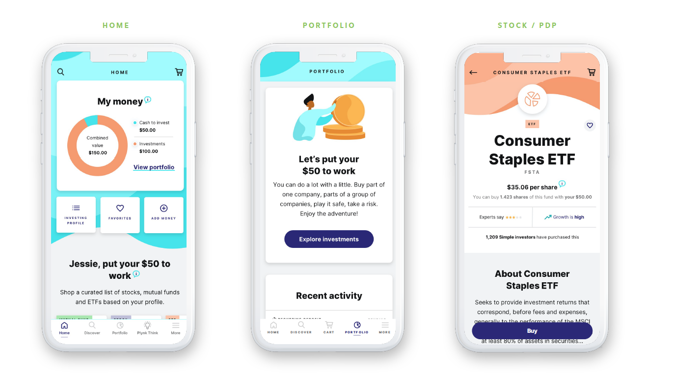
A sample of key screens
We broke Detailed Design into around five, three-week batches of design (one batch per epic). The goal of a detailed design phase is to create all the design artifacts an engineering team will need; e.g., mobile and desktop if responsive, OS-nuance if app, and all the design permutations such as alt states, error states, micro-interactions and so on.
Once we’d created around 250+ artifacts for MVP development, we added a couple batches around engagement—a little bigger lift than we thought!
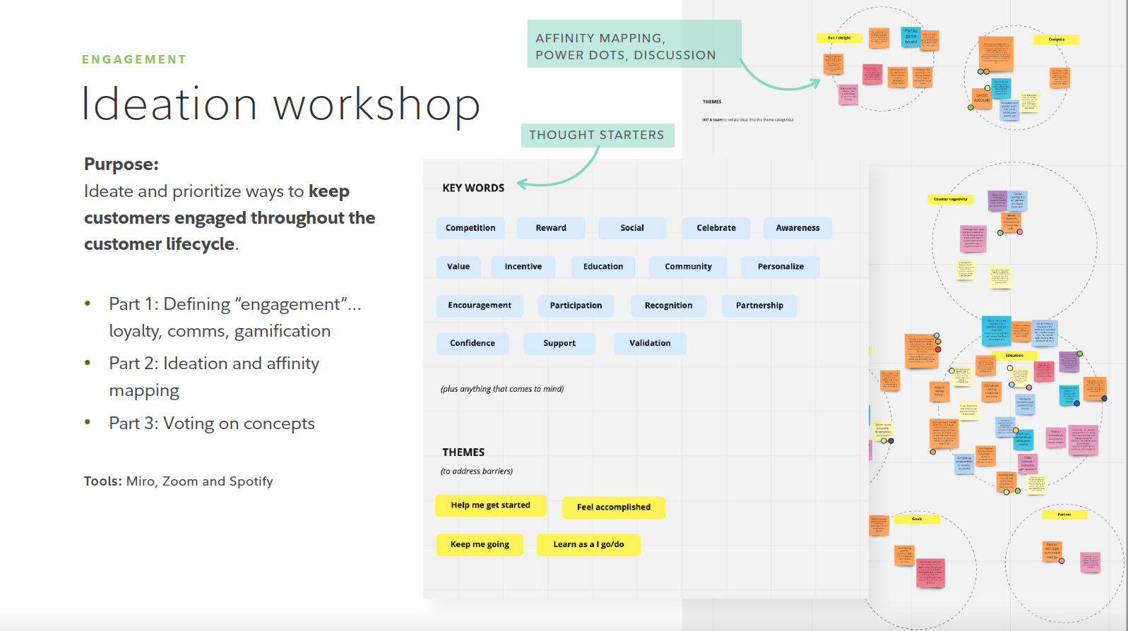
Process for alignment around engagement ideas for the new investing app.
Little workshopping with our client partners
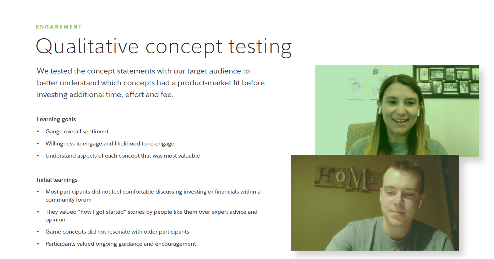
Concept and resonance testing with users.
A prioritized list based on user needs.
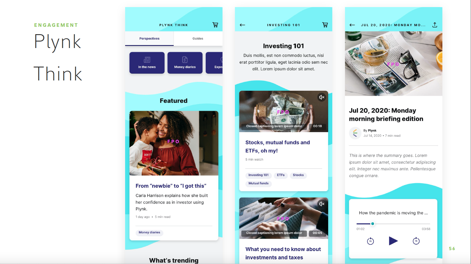
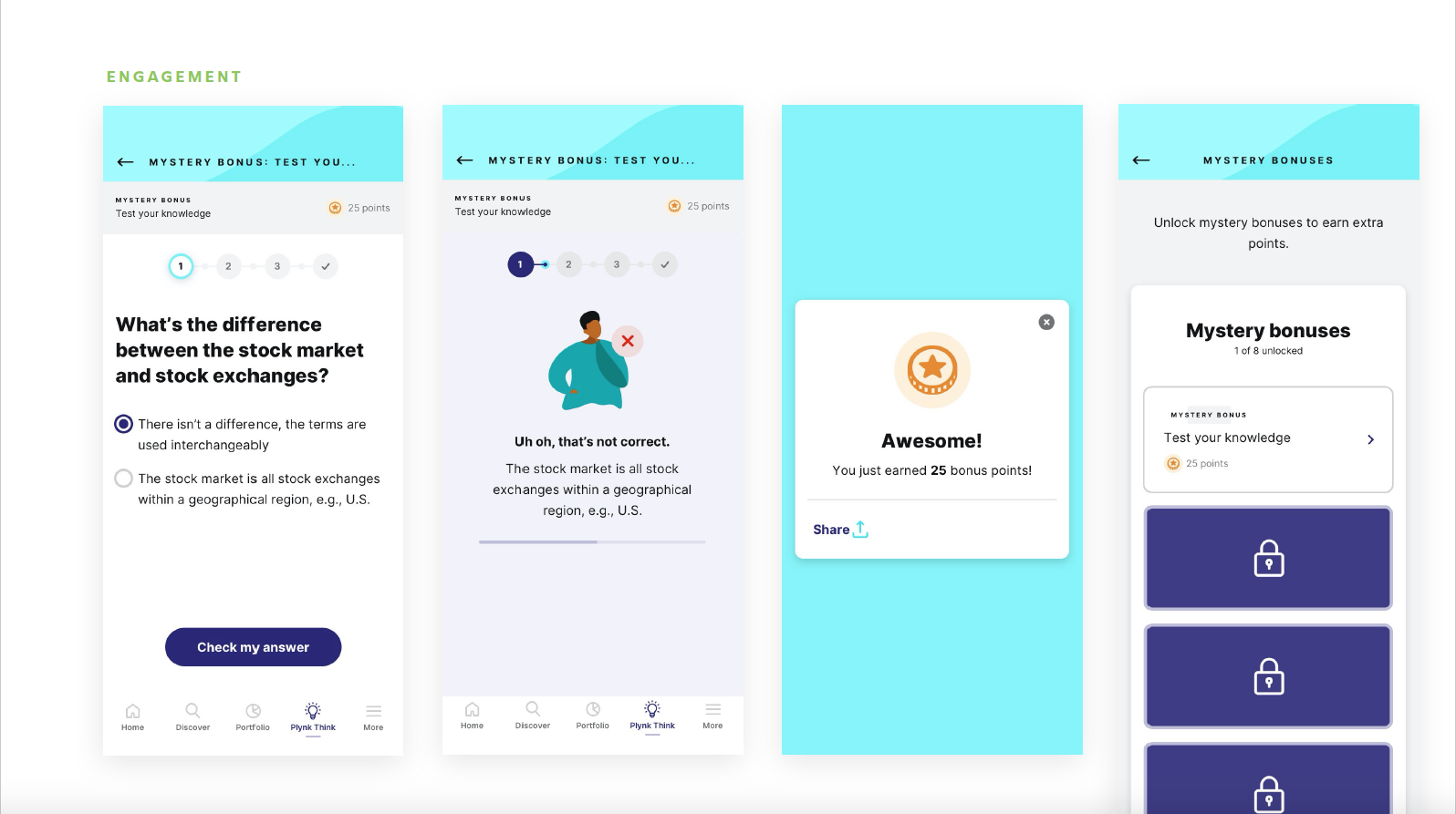
Then the team set to work to design artifacts for the new, larger epic, Engagement.
I named this!
These came out sweet!
These too—quizzes, points and bonuses.
We finished up in around July or August 2020, and the Plynk app launched Q2 2021.
The experience and design A-team (pretty good team if you can find ‘em):
ACD Experience: Steph Curran
ACD Experience: Liz Goodwin
ACD Visual: Kit Casey
BA/Product Manager/UX: Kim Looney
Design Manager: Laura Skaggs
Sr. Art Director: Florencia Balseiro
Designer: Quan Nguyen
Copywriter: Lynne Viera
Client Partner: Shiva Nadarajah
Creative Director: Jared Kelleher
Outcomes
Foundational elements of a brand, definition and place to build upon
Ownable illustration system with 30 animations
An organized design system with robust documentation
Hundreds of mobile app designs
9 happy stakeholders
6 prioritized opportunities to keep the novice investor engaged
Successfully transferred the project to Fidelity’s internal product team
You can find the app in the app store or learn more here, online.
I liked this project a lot, and I liked learning how to work with remote partners—my own and the clients.
J.

